 I use a Fitbit Ultra to keep track of my daily steps, calories burned, distance traveled, etc, in conjunction with calories consumed via the Fitbit Android app. While the Fitbit website offers a few interesting ways to visualize this personal data, exporting one's data to excel opens up a virtually limitless number of options in terms of self-quantified analysis. One of the most common metrics that anyone tying to shed some pounds would be well advised to keep track of is daily net calorie consumption (or reduction). There are many factors that can contribute to how quickly one gains or loses weight (age, sex, types of calories consumed, etc), but the simple idea that you need to burn more than you consume is a fundamental concept of weight loss.
By subtracting my daily calories burned from my daily calorie intake using a simple calculation in Excel, I can visualize my calorie intake/reduction progress over extended periods in one quick glance, something the Fitbit website surprisingly doesn't happen to show on its own. By adding a weekly average to the data, I can easily see behavioral trends in this area and one interesting piece of insight I was able to infer in my case is that my net calorie debit/intake tends to cycle in ~20 day intervals. The simplest way of quantifying cycles with this particular data is done by examining the peaks and troughs of my weekly average, then summing and averaging the distance between either the peaks or troughs themselves. The result is a clear indication of a broad trend in my behavior, self-knowledge that is only apparent when seen through the the lens of Excel and cycle analysis. With knowledge such as this, a dieter may be able to create a flexible/variable (as opposed to static/unchanging) calorie intake plan that is attuned to their own personal cycles. By doing so, they may be more likely to stick to a plan that doesn't go against their natural rhythms. Additionally, one could know when to "take the foot off the gas pedal" when the cycle is peaking while also realizing when to increase exercise intensity and/or reduce calorie consumption when the cycle is bottoming, so as to achieve maximum results.
And in case anyone was wondering, the two instances on my chart where the calorie reduction exceeded 2000 for several days in a row, once near the beginning and one near the middle of the chart, represent two 5 day fasts.
I use a Fitbit Ultra to keep track of my daily steps, calories burned, distance traveled, etc, in conjunction with calories consumed via the Fitbit Android app. While the Fitbit website offers a few interesting ways to visualize this personal data, exporting one's data to excel opens up a virtually limitless number of options in terms of self-quantified analysis. One of the most common metrics that anyone tying to shed some pounds would be well advised to keep track of is daily net calorie consumption (or reduction). There are many factors that can contribute to how quickly one gains or loses weight (age, sex, types of calories consumed, etc), but the simple idea that you need to burn more than you consume is a fundamental concept of weight loss.
By subtracting my daily calories burned from my daily calorie intake using a simple calculation in Excel, I can visualize my calorie intake/reduction progress over extended periods in one quick glance, something the Fitbit website surprisingly doesn't happen to show on its own. By adding a weekly average to the data, I can easily see behavioral trends in this area and one interesting piece of insight I was able to infer in my case is that my net calorie debit/intake tends to cycle in ~20 day intervals. The simplest way of quantifying cycles with this particular data is done by examining the peaks and troughs of my weekly average, then summing and averaging the distance between either the peaks or troughs themselves. The result is a clear indication of a broad trend in my behavior, self-knowledge that is only apparent when seen through the the lens of Excel and cycle analysis. With knowledge such as this, a dieter may be able to create a flexible/variable (as opposed to static/unchanging) calorie intake plan that is attuned to their own personal cycles. By doing so, they may be more likely to stick to a plan that doesn't go against their natural rhythms. Additionally, one could know when to "take the foot off the gas pedal" when the cycle is peaking while also realizing when to increase exercise intensity and/or reduce calorie consumption when the cycle is bottoming, so as to achieve maximum results.
And in case anyone was wondering, the two instances on my chart where the calorie reduction exceeded 2000 for several days in a row, once near the beginning and one near the middle of the chart, represent two 5 day fasts.
Science Trainer: technical analysis of self-quantified data
Monday, February 25, 2013
Variable Diet Plans and Net Calorie Debit Using Excel
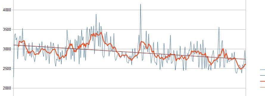
I use a Fitbit Ultra to keep track of my daily steps, calories burned, distance traveled, etc, in conjunction with calories consumed via the Fitbit Android app. While the Fitbit website offers a few interesting ways to visualize this personal data, exporting one's data to excel opens up a virtually limitless number of options in terms of self-quantified analysis. One of the most common metrics that anyone tying to shed some pounds would be well advised to keep track of is daily net calorie consumption (or reduction). There are many factors that can contribute to how quickly one gains or loses weight (age, sex, types of calories consumed, etc), but the simple idea that you need to burn more than you consume is a fundamental concept of weight loss.
By subtracting my daily calories burned from my daily calorie intake using a simple calculation in Excel, I can visualize my calorie intake/reduction progress over extended periods in one quick glance, something the Fitbit website surprisingly doesn't happen to show on its own. By adding a weekly average to the data, I can easily see behavioral trends in this area and one interesting piece of insight I was able to infer in my case is that my net calorie debit/intake tends to cycle in ~20 day intervals. The simplest way of quantifying cycles with this particular data is done by examining the peaks and troughs of my weekly average, then summing and averaging the distance between either the peaks or troughs themselves. The result is a clear indication of a broad trend in my behavior, self-knowledge that is only apparent when seen through the the lens of Excel and cycle analysis. With knowledge such as this, a dieter may be able to create a flexible/variable (as opposed to static/unchanging) calorie intake plan that is attuned to their own personal cycles. By doing so, they may be more likely to stick to a plan that doesn't go against their natural rhythms. Additionally, one could know when to "take the foot off the gas pedal" when the cycle is peaking while also realizing when to increase exercise intensity and/or reduce calorie consumption when the cycle is bottoming, so as to achieve maximum results.
And in case anyone was wondering, the two instances on my chart where the calorie reduction exceeded 2000 for several days in a row, once near the beginning and one near the middle of the chart, represent two 5 day fasts.
Friday, February 22, 2013
Weight Graph Analysis Using TA
 The attached chart is a great example of the insight financial technical analysis can bring to traditional weight charts. This particular chart plots my daily weight values in blue over the last ~11 months, and after a quick glance it becomes clear that the day to day values can be quite volatile. Two of the most common security charting techniques, the moving average and Bollinger bands, can be quite useful not only in making sense of this variability, but by also helping me keep these fluctuations in perspective. As anyone who has tracked their weight can tell you, there are times when you are doing everything right in terms of exercise and net calorie reduction, yet the pounds don't seem to come off as one might expect. This is where Bollinger bands can be useful.
Bollinger bands represent 2 standard deviations added to and subtracted from the mean, which happens to be my weekly average weight in this case (shown in orange). In a normal distribution, around 95% of the sample population is expected to fall within these values, which are represented on my chart as the grey lines above and below the daily and weekly average values. While weight values aren't technically normally distributed (or stock prices either for that matter!), the use of these bands are still quite useful in the sense that most values should still be expected to fall within this range. As my day to day weight change values begin to increase or decrease in size, the bands reflect this by widening (for an increase in volatility) and contracting (for a decrease in volatility). So when I am chugging along with my weight loss plan and the pounds are coming off quickly, the odds of a relatively dramatic subsequent increase in weight are actually increasing. This interpretation becomes clear when you look towards the beginning of my chart, when my weight was swinging widely between 185 and 195 lbs. After an initial spike up, the pounds came off just as quickly and almost to the same extent that they were added on. The tendency for weight values to behave like this is quite common, with the moving average serving as the center point of this oscillation, and I eluded to earlier, the use of moving averages on weight charts is one of the best ways to keep daily values in perspective.
Moving averages smooth data so that the short term volatility is eliminated, at the cost of some responsiveness. A moving average can be thought of as a "typical" value for the period in question, one week in my case. What is interesting about the moving average is the relationship of the daily values to the moving average itself, as the daily values tend to cluster either below or above the average and tend to stay there for similar intervals. This ebb and flow is the natural process by which we lose and gain weight, which can be comforting to someone attempting to shed some pounds. The red bar chart below my weight graph is the perfect visualization of this phenomenon. This chart, "7-day average daily weight loss", plots the cyclical nature of this process while also bringing to light the portion of time I was actually gaining weight, which is much higher than one might initially expect (during a phase were my net weight loss was pretty significant). Obviously the goal is to drop your overall weight, but the process by which this is done is fundamentally a give and take relationship: you lose some, you gain back a little less than you lost. The point is not to be discouraged by the counter-moves during the process.
The attached chart is a great example of the insight financial technical analysis can bring to traditional weight charts. This particular chart plots my daily weight values in blue over the last ~11 months, and after a quick glance it becomes clear that the day to day values can be quite volatile. Two of the most common security charting techniques, the moving average and Bollinger bands, can be quite useful not only in making sense of this variability, but by also helping me keep these fluctuations in perspective. As anyone who has tracked their weight can tell you, there are times when you are doing everything right in terms of exercise and net calorie reduction, yet the pounds don't seem to come off as one might expect. This is where Bollinger bands can be useful.
Bollinger bands represent 2 standard deviations added to and subtracted from the mean, which happens to be my weekly average weight in this case (shown in orange). In a normal distribution, around 95% of the sample population is expected to fall within these values, which are represented on my chart as the grey lines above and below the daily and weekly average values. While weight values aren't technically normally distributed (or stock prices either for that matter!), the use of these bands are still quite useful in the sense that most values should still be expected to fall within this range. As my day to day weight change values begin to increase or decrease in size, the bands reflect this by widening (for an increase in volatility) and contracting (for a decrease in volatility). So when I am chugging along with my weight loss plan and the pounds are coming off quickly, the odds of a relatively dramatic subsequent increase in weight are actually increasing. This interpretation becomes clear when you look towards the beginning of my chart, when my weight was swinging widely between 185 and 195 lbs. After an initial spike up, the pounds came off just as quickly and almost to the same extent that they were added on. The tendency for weight values to behave like this is quite common, with the moving average serving as the center point of this oscillation, and I eluded to earlier, the use of moving averages on weight charts is one of the best ways to keep daily values in perspective.
Moving averages smooth data so that the short term volatility is eliminated, at the cost of some responsiveness. A moving average can be thought of as a "typical" value for the period in question, one week in my case. What is interesting about the moving average is the relationship of the daily values to the moving average itself, as the daily values tend to cluster either below or above the average and tend to stay there for similar intervals. This ebb and flow is the natural process by which we lose and gain weight, which can be comforting to someone attempting to shed some pounds. The red bar chart below my weight graph is the perfect visualization of this phenomenon. This chart, "7-day average daily weight loss", plots the cyclical nature of this process while also bringing to light the portion of time I was actually gaining weight, which is much higher than one might initially expect (during a phase were my net weight loss was pretty significant). Obviously the goal is to drop your overall weight, but the process by which this is done is fundamentally a give and take relationship: you lose some, you gain back a little less than you lost. The point is not to be discouraged by the counter-moves during the process.
Subscribe to:
Posts (Atom)